
1. Introduction
In Revenue Series, I explained restaurant revenue using the same structure as blog ad revenue:
Revenue = Exposure × Conversion Rate × Average Order Value
- How Word of Mouth Actually Spreads — and Why Most Small Businesses Get It Wrong
- Why People Don’t Order — And How Menu Design Fixes It
- Impressionist Interior: How to Build Atmosphere on a Tiny Budget
Especially, I introduced Concept of Impressionist Interior Design: instead of rebuilding a Roman palace, invest in a 1% emotional anchor, then let the customer’s imagination do the remaining 99%.
We previously analyzed this dynamic through the lens of Impressionist Interior Design: rather than absorbing the massive capital expenditure of constructing a literal Roman palace, an operator invests in a 1% emotional anchor and allows the consumer’s imagination to construct the remaining 99%.
2. Shifting Conversion Rate to Food Decoration
Now, let’s talk about the third driver of conversion: food decoration.
Personally, I’m highly skeptical of over-investing in visuals. The truth is, people don’t store visual details in their long-term memory, which makes hyper-decoration a pretty low-ROI investment.
That said, we can’t completely ignore how food looks anymore. Today’s diners love to document their meals, turning their plates into free, organic word-of-mouth marketing. So, here is the pragmatic baseline rule we should follow: when a customer texts a photo of your dish to a friend, it shouldn’t make them squint and ask, “What on earth is that?” The visual presentation just needs to safely validate their choice, delivering a clean, decent impression of quality—and nothing more.
3. Engineering Flavors Over Aesthetics
(1) Expectation Management: The Disconfirmation Model
Consider the dynamics of dating profiles. When an initial profile photograph inflates expectations excessively, the subsequent physical interaction frequently results in disappointment. Conversely, entering an interaction with low baseline expectations often yields a positive psychological surplus.
In behavioral economics, this is classified as Expectation Disconfirmation Theory—the practice of under-promising and over-delivering. Food presentation operates under the exact same psychological constraints:
- Hyper-decoration artificially inflates consumer expectations, escalating the risk of flavor dissatisfaction.
- Instead, keeping the visuals modest while nailing the execution creates a great psychological surplus—the customer gets way more than they expected.
The goal here is simple: keep the presentation decent enough so that when a customer drops a food photo into a group chat, they don’t get embarrassed. The decorations are good enough as it is; what matters most is the consumer’s subjective satisfaction. It should just manage expectations safely upfront, and then let the actual taste do the heavy lifting.
(2) The Hidden Operational Waste of Excessive Decoration
Retaining a professional food stylist for a single-day commercial menu shoot can yield strong utility at a fixed cost of $500 to $800. Investing in a high-quality, one-time photo shoot creates a lasting capital asset you can use indefinitely, whereas spending labor on daily plate decoration is ephemeral. While it is true that customers might pay a premium for highly stylized food, and I am not suggesting the effect is entirely zero, the continuous drag on kitchen labor makes it visible as operational waste.
The authentic economic value of food resides within its flavor architecture—the structural rhythm through sweet, salty, umami, acidic, fatty, and resetting flavor profiles.
In contrast, the market frequently witnesses products like a lasagna lacking caramelized onion depth or béchamel complexity, yet buried under decorative nacho chips and raw basil. The result is a substandard taste profile wrapped in superficial aesthetics—style completely divorced from substance. Flavor execution must remain the primary objective; decoration functions as a secondary element, for three clear reasons:
Decoration Fails to Generate Pricing Elasticity
The core value creation of a dish concludes the moment the thermal cooking process stops. The physical placement of a mushroom to the left or right of a plate yields zero marginal utility.
Consider the absurdity of this pricing logic:
- Mushroom placed left: +$2.00
- Mushroom placed right: +$3.00
- Finely minced chives: +$1.00
Rational economic calculation dictates that whenever we add an extra manual motion to a process, we must evaluate whether it generates incremental value. In reality, moving a mushroom to a specific side of a plate adds an extra step to the workflow without increasing the final price of the dish. This labor is simply absorbed into fixed operating costs, masking operational waste.
While some highly stylized hipster restaurants deploy dedicated staff exclusively for plate decoration, this layout is specific to trend-driven venues engineered entirely to maximize traffic via Instagram hype. It does not reflect a sustainable model for a standard business operation.
Garnishes Expose the Kitchen to Cost Volatility
Garnishes like parsley, chives, and basil are usually there just to add a pop of color. But the real problem with these fresh herbs is that they spoil incredibly fast, their prices go all over the place, and a lot of them just end up in the trash.
If a heavy rainy season hits, the price of these specialty herbs can literally double overnight. When you look at how fragile the market supply is, spending time and money on a garnish that doesn’t even add to the flavor rarely makes business sense.
Decoration Creates Production Bottlenecks
In a fast-paced kitchen, every single extra move slows you down. Even reaching for a single lemon slice during the peak rush hour creates immediate drag.
Just look at the standard workflow for a decorated plate:
- Grab the plate → Plate the food → Drizzle the sauce → Open the fridge → Grab the garnish → Close the fridge → Finally place the garnish.
That’s seven separate hand movements for something that adds absolutely zero flavor. It is a pure bottleneck.
Our core philosophy is all about streamlining production. An efficient kitchen needs to cut out these useless steps to keep the workflow flexible and labor costs down. Food decoration, by its very nature, introduces specialized, non-essential tasks that do nothing but inflate your overall operating expenses.
(3) Avoiding the Hazard of Aesthetic Neglect
At the same time, looking too sloppy is a death sentence for your brand. To go back to the online dating analogy: nobody is going to swipe right on a terrible profile picture, no matter how great of a person you claim to be.
Plus, let’s be honest about mainstream dishes like pizza, pasta, or burgers—pretty much everyone out there can already cook at an 80% quality level. In a crowded market, taste alone isn’t enough to stand out anymore. That’s exactly where the visual presentation steps in to close the deal.
So, our real goal here is to figure out that sweet spot—the perfect, cost-effective level of presentation that does the trick without breaking the bank.
4. “Edible” is Your Minimum Threshold
(1) What Actually Makes Food Look “Edible”?
To put it bluntly, as long as your food looks appetizing and edible, your decoration has already done its job to drive conversions.
Think about it: the exact same food looks delicious on a clean plate, but if it’s sitting in a clean trash can, nobody will touch it. Why? Because edibility is all about form and function.
- Form: A half-eaten schnitzel or a steak turned into a purée still has the same protein, but visually, it exits the “edible” category.
- Function: This comes down to natural color contrast, surface gloss, moisture, and texture. A dried-out steak signals danger to our brains, not nutrition.
Anthropologist Mary Douglas argued that “dirt” isn’t about hygiene; it’s about things being out of order. Edibility works the same way. The moment the natural form and function of food collapse, our brains stop seeing it as safe.
(2) The Psychological Evidence
Psychologist Paul Rozin showed that our food choices rely on three things: function, pleasure, and aesthetics. While pleasure and aesthetics change from culture to culture, functional cues do not. Nobody eats food that looks dangerous or spoiled.
So at the absolute minimum, your food just needs to:
- Preserve its proper form.
- Display healthy nutritional signals (natural color, gloss, moisture, and texture).
That is it. You don’t need food sculptures, table performances, or paintings on a plate. Just make the food look healthy and edible, and let the actual flavor do the rest of the heavy lifting.
5. Impressionist Food Decoration in Practice
Just like our interior strategy, we apply the exact same Impressionist principle to the plate: Add a 1% emotional anchor that signals “this is fresh and edible,” and let the customer’s imagination complete the rest.
(1) Leverage Natural Color Contrast
The human brain is wired to see color contrast as a sign of nutritional diversity. You don’t need fancy, expensive garnishes for this. Just having three distinct colors on the plate is more than enough.
Take a classic Goulash, for example:
- Beef and Tomato (Red) → Sour cream (White) → Celery (Green) → Potato/Carrot (Yellow)
The dish already has all the color it needs naturally. Mission accomplished. Sprinkling dried parsley on top at the end adds absolutely nothing—it’s just visual noise.
(2) Show the Internal Structure
I once ordered a lasagna that collapsed into a mushy pile the second I took a spoonful. That is bad decoration. It’s not bad because it wasn’t “pretty,” but because it hid the structural integrity of the food.
Good presentation reveals exactly how the food holds itself together. Keep your layers intact and let the customer see the build. Structure builds trust.
(3) Skip the Heavy Toppings and Sauce Drizzles
Nacho crumbs, random parsley sprinkles, edible flowers, and zigzag sauce lines can look nice, but usually only when the dish itself is missing something. If your food already has a clear structure and natural color contrast, these toppings are just redundant.
Instead, aim for clean plating with intentional negative space. For example:
- Center the steak.
- Pool the glossy gravy lightly to the side.
- Place the roasted potatoes neatly on one side.
Nothing extra. Nothing shouting for attention.
(4) Maximum of 3 Sides on One Plate
Piling everything onto a single plate feels efficient. It gives the customer that “complete meal” vibe and saves the kitchen from washing extra dishes. Plus, a packed bowl can look great in a quick photo.
But there is a hard limit. I once saw a single plate packed with steak, fries, herb butter, gravy, and a fried egg. That’s six different elements. The moment I started cutting the meat to share with friends, the grease soaked into the fries, and the egg yolk ran everywhere. In seconds, the plate looked like a disaster zone.
When a plate is overcrowded, the customer can’t relax. They end up maneuvering their fork like a surgeon, terrified of accidentally mixing the wrong flavors. It breaks the immersion of the meal.
- The Rule: Keep it to a maximum of three sides.
Keep the visual focus on the main dish. Let the meal feel calm and organized, not crowded.
Furthermore, rather than packing every element onto a single plate, structuring extra sides as affordable add-ons yields higher customer satisfaction. This model provides the customer with a sense of autonomy, allowing them to make deliberate choices while enjoying the baseline interaction with the service staff. Compared to a setup where a server simply drops everything off at once and disconnects, this approach creates a distinct relational appeal that strengthens the overall hospitality experience.
6. Impressionist Food Decoration (Practice)
Let’s look at real examples.
(1) Schweinshaxe (Pork Knuckle)


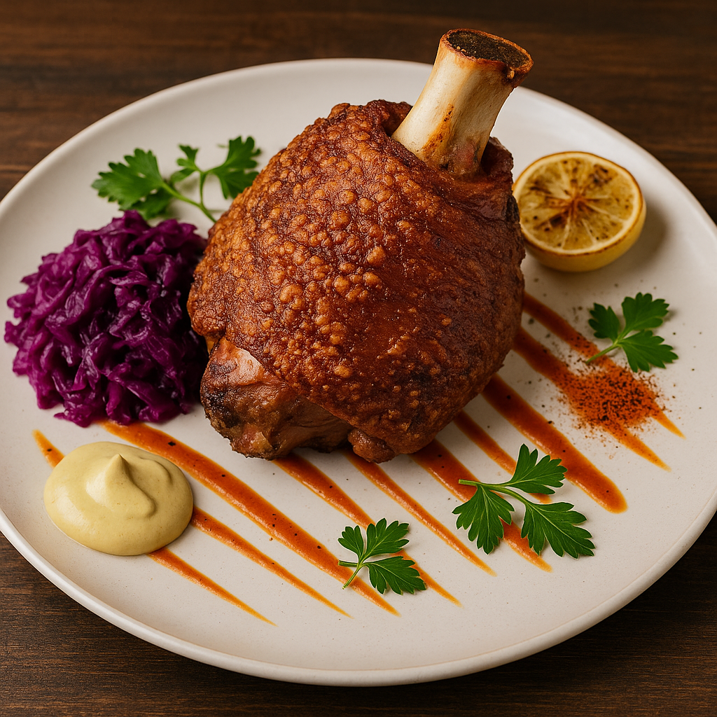
- Photo 1: My own, with zero decoration.
- Photo 2: Generated with ChatGPT (simple but colorful)
- Photo 3: ChatGPT (zigzag sauce, parsley, lemon, red cabbage)
Photo 1 is too plain. Photo 3 is visually busy and high-effort. Photo 2 strikes the balance—color contrast, visible structure, and minimal hand motions. That’s what we want.
(2) Other Dishes


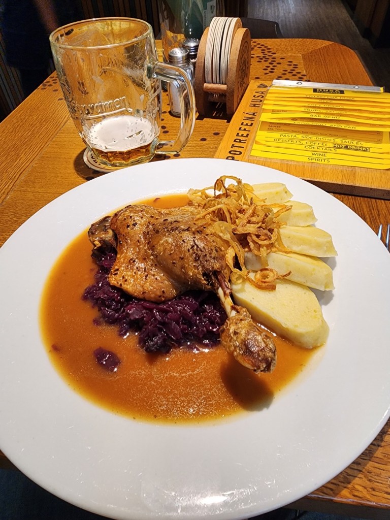

- My own Svickova
- My own Jägerschnitzel
- My own Hopel Popel
- Bohemian Duck (from Czech trip)
- Apple Strudel (also from trip)
None of these are “pretty,” but they’re clearly edible—form is intact, color and moisture are present. Customers even take pictures sometimes. (Not much, Haha) Of course, I have no doubt that you, the readers, will be able to create much more efficient and stylish decorations.
7. Conclusion
Food decoration is an internal trigger that boosts conversion rate. But since it doesn’t add direct value, it must be efficient. The ultimate goal of a restaurant is not to be beautiful. It’s to be delicious. And deliciousness is not just about taste—it’s about a perfect rhythm of flavor and a perfect rhythm of experience.
Just plant a 1% emotional anchor (form + function), so the dish looks “edible.” That’s the minimum threshold for your food to be shareable—and sharable food is the beginning of word-of-mouth.

If you enjoyed this article, you can support the project – thank you!