Subtitle: Design Less, Convert More — The Psychology of Low-Budget Interiors
1. Reminder
So far in this QnA series, we’ve broken down revenue like this: Revenue = Exposure × Conversion Rate × Average Order Value. Then we tackled each part, one by one.
- QnA #9-1 — Exposure: We talked about foot traffic, Online/Offline exposure.
- QnA #9-2 — Repeat Visits: We focused on internal triggers, word of mouth.
- QnA #9-3 — Menu Board = Conversion Tool: We covered the most overlooked factor: the menu board. Your menu should work like a blog post: Thumbnail → Header → Subheadings → Price & Description
Why this matters:
- Guests understand the menu faster
- Emotional resistance goes down
- Miscommunication (and legal risk) drops
And when that happens, conversion rate goes up. Now we move to the second big conversion driver:
About Interior Design
We’ve been consistent about three things.
- Heavy interior investment doesn’t last: People get used to it. Then you feel forced to renovate every three years. That’s bad ROI.
- Visual overload raises expectations: Higher expectations = higher chance of disappointment.
- 3. Endorphin-style stores shouldn’t rely on visuals: They should be built on taste and sound, not flashy design.
Still, let’s be realistic. You can’t ignore interior completely. Customers see the space before they taste the food. So here’s the compromise we propose: “If your interior is cheap but not embarrassing, it’s good enough to boost conversion.”
2. Can You Really Design a Store That’s Cheap but Not Embarrassing?
(1) Realism vs. Impressionism vs. Abstraction
Interior design is a form of art. So let’s borrow three concepts from art history.


- Realism (Jean-François Millet) [Source: Wikepedia]
- Impressionism (Claude Monet) [Source: Wikepedia]
- Abstraction (Wassily Kandinsky) [Source: Wikepedia]
Now let’s translate these into store interiors.
🎨 Realism → Hyper-Physical Interior
Realist paintings try to reproduce reality exactly. Light. Texture. Wrinkles. Material. In stores, this becomes:
- Real brick
- Solid wood
- Heavy iron fixtures
- Vintage props, perfectly styled
When customers walk in, they stop. Phones come out. It feels like an exhibition. And yeah — it’s impressive. But let’s be honest. It also costs a fortune.
🌅 Impressionism → Mood-Based Interior
Impressionist paintings don’t copy reality. They capture sensation instead. Light. Movement. Atmosphere. Monet’s paintings are blurry. No sharp sun. No clear boats. But your brain fills in the blanks.
“Ah, early morning.” Or “Sunrise over water.”
That’s cognitive reconstruction. Your memory does half the work. And that’s exactly how Impressionist interior design works. In economic terms, Impressionist paintings mean that the marginal utility does not diminish because they look new every time you see them. Therefore, they hold an exceptionally high value. To create a classic feel in a restaurant, you don’t need to perfectly replicate an old European castle. Just use one or two anchor pieces as focal points and leave the rest of the space simple.
Example: You hang one chandelier. And leave the ceiling mostly bare. That chandelier becomes the emotional anchor. Everything else stays quiet. Customers don’t take many photos. But they say:
“It feels nice here.” , “I like the vibe.”
That’s enough.
🧩 Abstraction → Concept-Driven Interior
Abstract art has no direct link to reality. Meaning depends on the viewer. Sometimes, the title is the only clue. In interior design, this becomes:
- Disjointed layouts
- Surreal objects
- Strong personal expression
These are the experimental concept cafés. Artsy spaces. Owner-driven aesthetics. Customers usually say: “What is this place?”, “So hip.”, “Total Instagram bait.” It’s striking. But also polarizing. Some love it. But Many don’t come back. While abstract concepts are intriguing, they don’t always trigger a concrete memory or a specific feeling.
(2) Why the Toyota Pub Prefers Impressionism
Toyota pubs run on tight budgets. So we don’t waste money on heavy interior builds. Instead, we follow one rule:
Invest in 1% strong anchors. Let the customer’s brain build the remaining 99%.
That 1% can be anything:
- One vintage picture frame
- A single chandelier
- A German beer poster
- A small brick oven
These are anchors. You don’t need to rebuild a full European pub like you’re setting up a movie scene. You only need to suggest the idea of it.
For example:
- Hang one Monet-style painting.
- Use soft orange lighting.
- Add one or two well-placed props.
That’s it. Will they take pictures? Maybe. Maybe not. Owners often feel disappointed when guests don’t take photos of their place. However, taking photos can sometimes mean they don’t plan on coming back. After all, if you’re going to visit again, why bother taking pictures?
But if they sit down and think: “You know… this place isn’t bad. Kinda cozy.” Then you already won. That feeling is enough. Enough to stay. Enough to come back. Enough to recommend the place without embarrassment. Restaurants and pubs are naturally busy spaces—staff are constantly moving, people are chatting, and music is playing. If the interior is also over-the-top, the sensory overload quickly leads to brain fatigue. With just a few key points, the human brain can automatically synthesize sound, sight, and taste to define the concept of the space. You just need to pave the way for the brain to do its work. The key to repeat visits is comfort.
(3) Impressionist Interior: The Real Thing Doesn’t Matter
Give people the right 1% cue, and the brain does the rest. If this sounds like something I just invented, it isn’t. There’s solid psychology behind it.
Gestalt Psychology — The Brain Hates Gaps
Gestalt psychology says this: Humans hate incomplete information. When something is missing, the brain fills it in automatically. Example: “I bought blueberry, watermelon, and ap…”
Most people instantly read that as “apple.” The word is cut off. But “blueberry” and “watermelon” already set the category. Your brain completes the pattern. That’s contextual anchoring. Give part of the signal and perception completes the rest. 📎Link: Here’s a great resource on Gestalt Principles
Anchoring Effect — First Signal Controls Perception
Daniel Kahneman calls this the Anchoring Effect. Our judgment is strongly influenced by the first reference point we see. Example: You visit a Tesla showroom. Then you walk into an Apple Store. Suddenly, the iPhone feels… affordable. But reverse the order. Visit Xiaomi first. Then Apple. Now the same iPhone feels expensive. Nothing changed. Only the mental anchor did.
Emotional Design — Feelings Beat Materials
Donald Norman explains this in Emotional Design
“Design is not about physical perfection. It’s about emotional activation.”
A handcrafted hardwood table and a cheap painted one can create the same emotion. If the feeling is triggered, the object becomes part of emotional memory. And that’s what people remember.
Conclusion of This Section
Impressionist interiors use the same mechanism. You don’t build reality. You plant emotional cues. The brain builds the rest. Guests walk in and say: “Hmm… feels kind of French.” “Look at a bit vintage.” Even if a shop only has oak barrels, wine bottles, chandeliers, and decorations in French, people perceive it as having a French feel. That’s the trick.
Minimal investment. Maximum emotional return. Zero embarrassment.
3. Real-World Examples of Impressionist Interior
Now that we’ve covered the philosophy and psychology, let’s see how impressionist interiors work in real spaces. Below are two cases. One real. One imagined. Both follow the same rule:
Invest in a tiny emotional anchor. Keep everything else quiet.
(1) Modu Café, California — Let Light Do the Design
[Official Homepage of Modu] Modu Café is almost empty by design. Walls are plain. Signs are minimal. Decorations are close to none. Even the storefront is understated. So what dominates the space?
Sunlight. The café is built with large glass walls. Light pours in from morning to afternoon. As a guest, you don’t stare at the walls. You start noticing how the light changes. Shadows shift. Brightness moves across your table. Time becomes visible. That’s the experience.
And the result? It feels like a Monet painting. Not because they hung Monet on the wall, but because they let nature paint the room. No heavy design budget. No visual overload. Just light as the main character.
(2) A Fictional Italian Restaurant
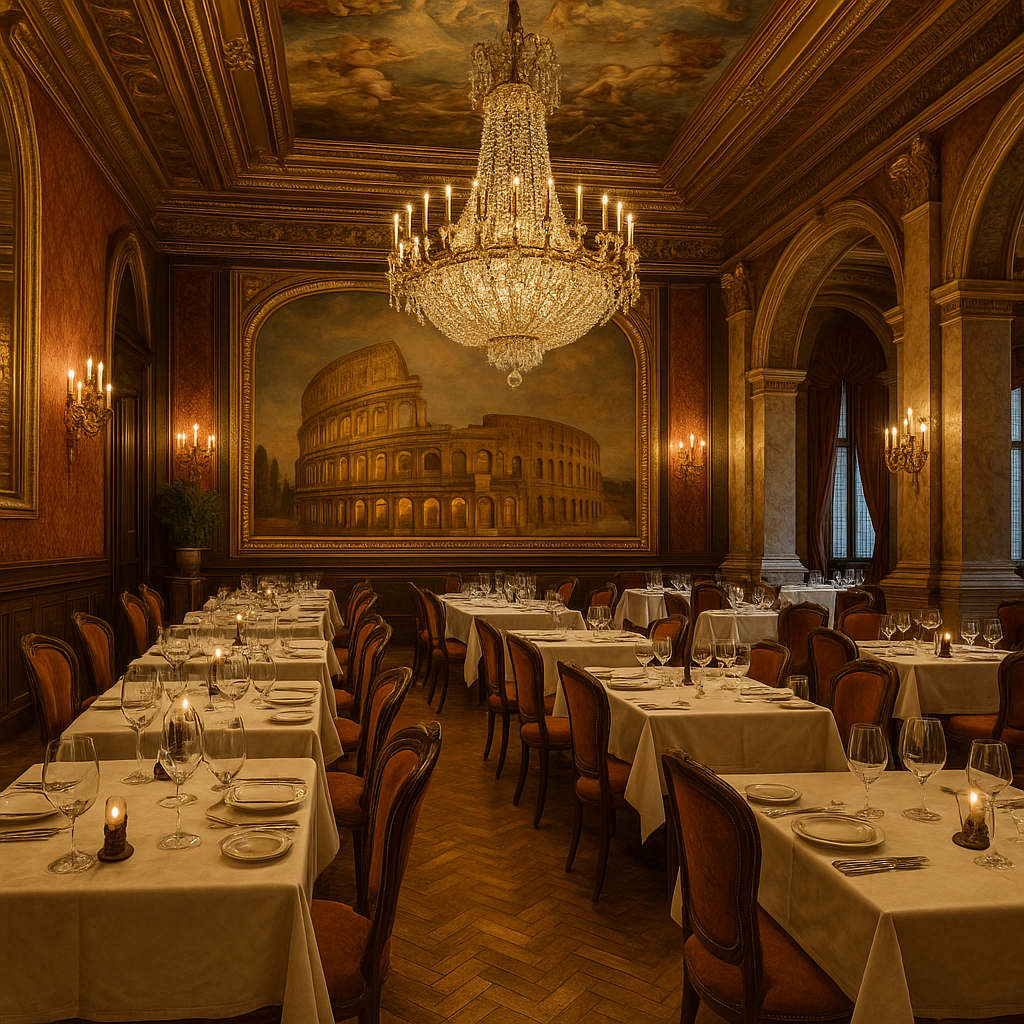
[Photo: Fictional Italian Restaurant image]
We’ve all imagined it. A perfect Italian trattoria:
- Hand-carved furniture
- Imported tiles
- Stone oven
- Warm chandeliers
- Live violin music
Sounds amazing. And also… insanely expensive. Not just to build. But to maintain. This is where impressionist design saves you. Instead of rebuilding Italy, you plant one strong Italian cue.
One anchor. That alone is enough for customers to say: “It kind of reminds me of Italy.” Even if the rest of the space is simple, that one cue carries the emotional load. More importantly, it gives people something to point at and talk about without feeling awkward. The rest of the atmosphere? That’s your food. That’s your music. If your pasta and playlist already tell the story, you don’t need visual noise on top of it.
Bonus Tip: Use a Digital Frame
Today, you can buy electronic frames that rotate images every few minutes. This lets you change visual rhythm without repainting walls or printing posters. If your store is music-centered, for example:
- Photos from past live shows
- Album covers
- Instruments
- Vintage posters
I actually use one myself. I’ve noticed something interesting. When conversations slow down, guests glance at the frame. It works like an emotional reset. A soft way to re-sync the rhythm at the table. Simple. Subtle. Very effective.
(3) Counterpoint: “But Don’t Guests Want Something to Look At?”
Fair question. Let’s answer it properly. Too much sensory input creates cognitive fatigue. This is known as sensory overload. When a space is visually crowded, attention scatters. People stop feeling immersed. They start scanning instead of settling in. Empty space does the opposite. It calms the autonomic nervous system. It allows focus on the few emotional cues you’ve chosen. So yes — people want something to look at. But that doesn’t mean everything should compete for attention. One or two strong anchors often create deeper emotional impact than a room full of visual noise.
4. Impressionist Interior – Practical Guidelines
(1) You’re Not Building a Roman Palace.
You’re Just Suggesting One. Your goal is not to recreate Caesar’s villa. Your goal is to trigger the memory of a palace. To hint at a theme — not to shout it. You’re not building a movie set. You’re planting emotional cues. Let’s say you’re designing an Italian-themed restaurant. Here’s a simple cheat sheet. These anchor items can suggest “Italy” without screaming it.
| Type | Purpose | Example Items |
|---|---|---|
| Rotating Art Frame | Create local identity or visual rhythm | Roman ruins → Florence alleyways → Italian movie posters |
| Flag or Pattern Props | Subtle cultural signals | Small Italian flag, thin tricolor wall strip |
| Animal or Character Symbol | Memorability and soft branding | Italian cat, Vespa figure, Venetian carnival mask |
| Miniature Objects | Table-level emotional anchors | Empty wine bottle + candle, mini vinyl record, tiramisu model |
Even this small set is enough to activate Italian emotional cues. After placing the anchors, do something important: Leave space around them. Empty space is not wasted space. It’s what makes anchors visible. Design flow like this:
- One chandelier to focus the gaze
- Slightly dimmer surroundings
- Italian music in the background
No heavy decoration. No visual clutter. You get immersion without overdesign.
(2) Interior Desire Checklist — Stop Before You Overspend
Let’s be honest. Everyone — especially restaurant owners — gets tempted by cool visuals. Pinterest. Instagram. Café tours. It all looks amazing. But before you spend money, run through this Impulse Stop List. This table shows:
- What you think you want
- Why it usually fails in real stores
- What the impressionist alternative looks like
| Interior Element | Your Psychological Intent | Why It Fails (Real-World) | Impressionist Fix |
|---|---|---|---|
| Exposed Brick / Cement Walls | Vintage European vibe | High renovation cost, hygiene issues, dust | Brick-pattern wallpaper + spotlight to fake texture |
| Epoxy Flooring | Clean, industrial aesthetic | Discolors, peels, smells in 6–12 months | Vinyl sheets + modular mats, easy replacement |
| Chandeliers / Real Candles | Warm, classy atmosphere | Hard maintenance, fire hazard, uneven lighting | LED candles + max one real chandelier |
| Fancy Fonts on Menus / Signs | Instagram look | Low readability, slow orders, visual fatigue | H1: clean sans-serif / H2: emotional script |
| European Props (bikes, dolls, bears) | Strong cultural signal | Dust collectors, outdated fast | Use only 1–2 anchors, surround with empty space |
| Wall Quotes / Foreign Phrases | Show depth and personality | Cringe translation, breaks immersion | Limit to 1–2 short lines, leave rest blank |
Here’s the pattern: Most design urges are not about function. They’re about self-expression. But self-expression is expensive. And it ages fast. Impressionist design does the opposite. It hides effort. It saves money. And it lets customers complete the story themselves. It is a mindset that puts the customer at the center.
(3) One Real-Life Emotional Anchor
Let me share a small object I brought back from a trip to the Czech Republic.

It’s just a bohemian textile wall hanging. Cost me about 30 dollars. And honestly, I’m not an interior person. I don’t enjoy styling. I don’t have visual taste. I just hung it up. No design concept. But here’s the funny part. Even Czech aunties who visited the store never questioned it. They didn’t say it looked fake. They didn’t ask why it was there. They asked:
“Where did you get this?”, “Where did you learn to make svíčková?”
Which means one thing. It worked. It felt authentic enough. So if someone like me — with zero visual flair — can pull this off, you can definitely do better.
5. Final Thoughts — You Don’t Need the “Real Thing”
You Just Need to Suggest the Feeling.
Whatever concept you’re aiming for, you don’t need to recreate it in high resolution. You’re not a museum. You’re not building a movie set. You’re not importing cobblestones from Florence. All you need is this: One emotional anchor. Just one.
Give the customer that single spark, and the brain does the rest. It stitches the atmosphere together from memory, imagination, and emotion. That’s the core philosophy of impressionist interior.
Filling by subtracting.
Showing less. Letting guests feel more. Not with slogans. Not with expensive props. Just with:
- Light
- Silence
- Rhythm
- And one carefully chosen anchor
That’s it.

If you enjoyed this article, you can support the project – thank you!